CSS Text Shadow generator for lazy people.
Pick a predefined style from the gallery or generate a text shadow with your preferences. Set up the desired attributes to get the CSS code.
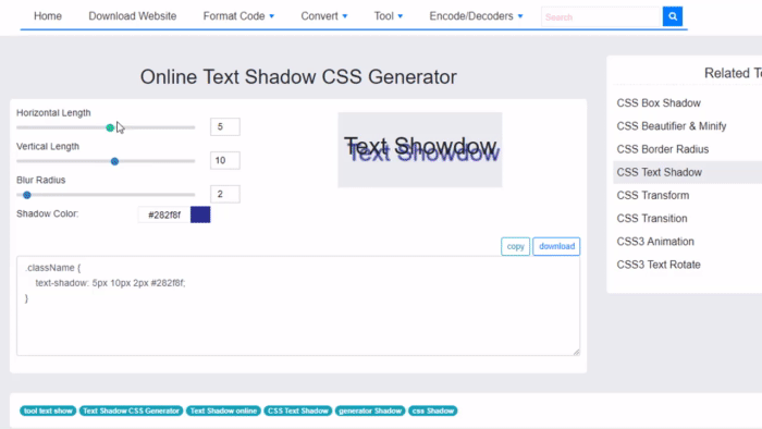
Shift the shadow right/down, set the blur and opacity and pick a color from the palette to get your CSS. Use the online editor to adjust your style manually. Follow the evolution of your shadow in the live preview where you can set a custom text and background color.
CSS3 Text Shadow Explained
The CSS3 text-shadow property is one of the most popular techniques of progressively enhancing the design of a website. Although it was originally in the CSS 2.1 specification, it was withdrawn due to lack of support. However it is now back in CSS 3 and has widespread support amongst modern browsers.
It takes four values: the first value defines the distance of the shadow in the x (horizontal) direction, the second value sets the distance in the y (vertical) direction, the third value defines the blur of the shadow and the last value sets the colour.
While this is relatively easy to remember compared to other CSS3 rules such as border-radius, it is useful to have a generator such as this so that you can generate your text-shadow in real time and fine tune it with Photoshop-like controls.