CSS Transform generator for lazy people.
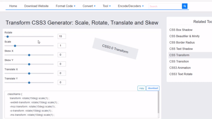
Set the scale, rotate, translate, and skew and watch the live preview to get the desired view.
Avoid setting extreme values for the skew property because the preview might cover the settings panel. In this situation you will have to refresh the page.
Scale, Rotate, Translate and Skew
Scale works like you would zoom in and out the targeted element. The default scale value is 1, which works as a multiplier of the original size. This means that 0.5 halves while 2 doubles the section.
Rotate the element clockwise with the second property that's set in degrees. Turning with 180° puts the object upside down while 360° takes is back to its original upright position. Set any positive or negative value or even decimals.
Translate shifts the element with pixels related to its original position. The X value horizontally while Y vertically when there rotate attribute is zero.
Skew the objects on their horizontal (X) or vertical (Y) axle.
CSS transform Explained
The transform CSS property lets you rotate, scale, skew, and translate an element. It modifies the coordinate space of the CSS visual formatting model.
Definition and Usage
The transform property applies a 2D or 3D transformation to an element. This property allows you to rotate, scale, move, skew, etc., elements.
Browser Support
The numbers in the table specify the first browser version that fully supports the property.
Numbers followed by -webkit-, -moz-, or -o- specify the first version that worked with a prefix.
Syntax
transform: none|transform-functions|initial|inherit;